What Goes Into Designing an Awesome Logo?
Thursday, October 15th, 2015
Designing an awesome logo has more to do with colour and shape than you may realise. Making meaning with a logo is essential to brand building. These stunning examples of logo design are the perfect inspiration!
The role of colour, shape, and meaning when designing an awesome logo
Colour, shape, and meaning are the three most essential elements of logo design. When combined, these three factors work together to portray concepts clearly and effectively in a visually appealing and (hopefully) creative way.
Colour
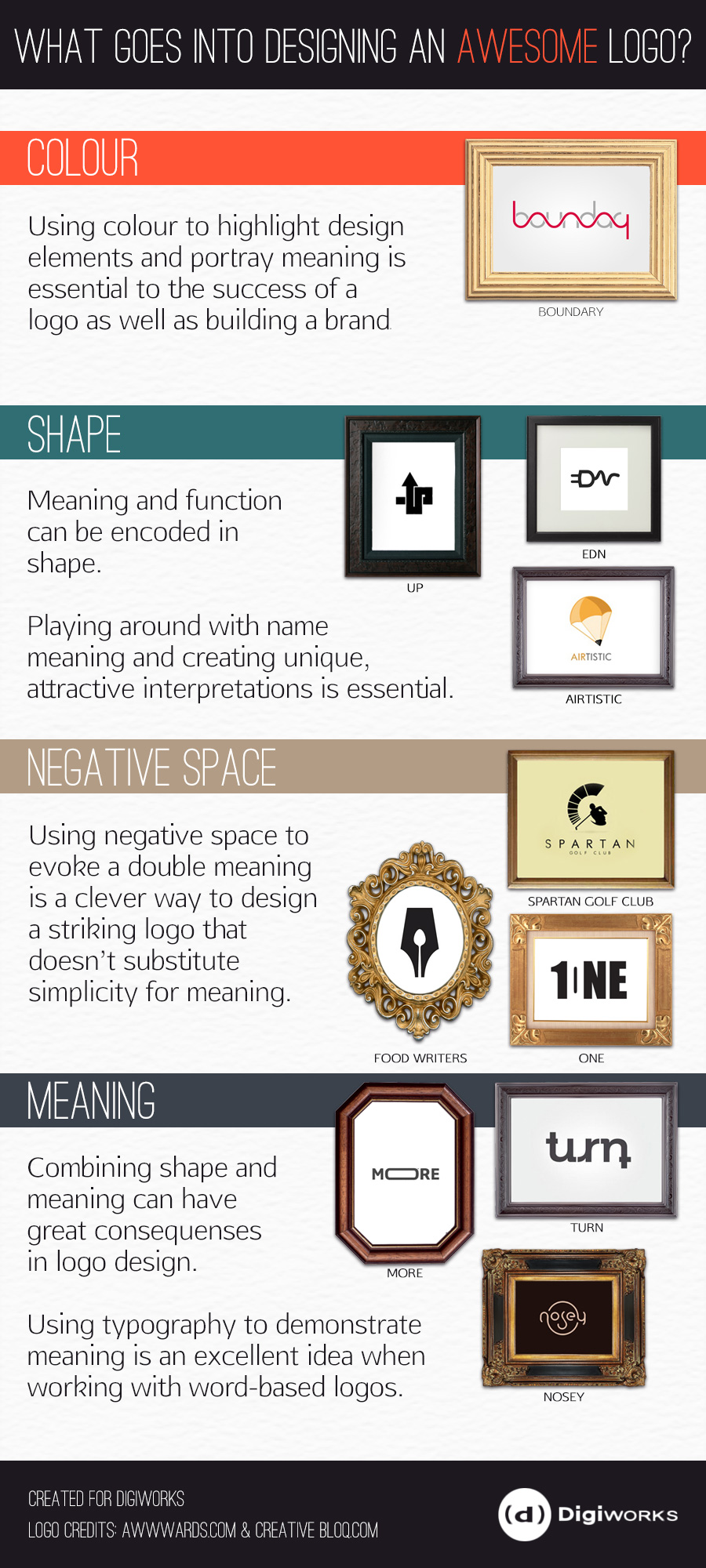
Colour in logo design is typically utilised as a tool for highlighting elements of a logo, brand building, and to encode meaning. In the case of the logo for the IT company Boundary, the red design feature, that not long indicated the boundaries of the word, but also incorporates a sign wave (perhaps to imitate the graph of alternating current and allude to electricity) which completes the shapes of the grey letters. Without the colour choice, the effect would be lost.
Shape
In the case of shape, designers often play on the name of client and incorporate related shapes to indicate meaning – often in the form of a play on words or by combining well known shapes to make a uniquely shaped logo.
The Urban Public Apparel logo (UP) by Muamer uses the recognisable arrow shape, and layering that gives a dynamic quality to the logo which demonstrates the acronym.
The clever conversion of an acronym, in the EDN Logo by Eden Clairicia uses negative space, and varied fonts to create the shape of a power plug. The typography to entirely new shape conversion is simple and elegant.
Airtisitc, by AlexToth, is a clever combination of the shape of a parachute and a pencil to portray an usual name and concept as a logo.
Negative Space in Logo Design
Synonymous with shape, using negative space in logo design can make for some creative double entendre logos.
Clean and simple, the minimalist Food Writers logo reinterprets the shape of a fountain pen by using the negative space to include a food-related shape, the spoon.
The Spartan Golf Club logo is an excellent example of how more complex designs benefit from negative space “illusions”. The swing of the golfer, and the golfer himself, create the profile of a Spartan warrior in a helmet.
The One logo utilises negative space to create a nifty logo incorporating both the number “1” and the word “one” effortlessly.
Meaning
Typography has always been a go-to option for unique logo design by creating unique logo with custom type.
More is a clever example of how typography is used to demonstrate the concept in stretching the “o” out.
The Turn logo takes this one step further and utilises the typographical element of this design to not only create a number of turns in the logo, but enable to logo to retain its meaning if you physically turn the logo 180 degrees.
Simpler, by equally effective, the Nosey logo uses the shapes of the letters to create a face within the word.
What are your favourite logos and why do you like them? Tell us about them in the comments below!
Logos from Awwwards and Creative Bloq


