5 Things You Need to Know About Responsive Web Design
Friday, July 10th, 2015
So you’re ready to get your business online, and you want a cutting edge website to wow your clients? Responsive web design is essential in the current online environment. Here’s everything you need to know to get started.
Just Go with the Flow
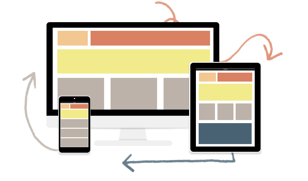
Responsive web design is about fluidity of website structure. The way your website is viewed on a smartphone, for example, is very different to how it’s viewed on a notebook screen, or a 24” monitor. The very essence of responsive websites is that the process of structuring content is fluid and adaptable, and can change the way it is displayed depending on who is viewing your website, and how they’re viewing it.
It’s All About Devices
When browsing on a cell phone, you can still come across websites that offer a redirection to their mobile website. Before responsive design, it was essential that websites had a mobile and desktop version to ensure that all of their viewers had the best, and most effective, use of their site. However, now that smartphone displays are larger, touch screens are a dime a dozen, and the number of internet users browsing on their phone outweighs the number browsing on a desktop device, like a personal computer, responsive web design became the way forward.
One Website to Rule Them All
Catering for phones, tablets, personal computers, and other devices isn’t the only upside of responsive web design. One website, which can shift and change to the display of the device it’s viewed on, also means that only one set of content needs to be managed. From Search Engine Optimisation, to daily updates, responsive web design lets you focus on one website – less hassle, more continuity.
Keeping it Simple
As responsive web design has matured, and the brilliant horde of web designers and developers have begun to innovate and perfect this scheme of website creation, the way information is relayed to website users has been simplified. Minimal design, using images instead of reams of text, and the use of concepts that have developed over the years we’ve been on the world wide web; like arrows indicating “next” or “previous”; are just a few, clever ways in which less has become more.
User Experience in King
In the end, it’s really all about how easily visitors to your website can see what you’re about and decide whether they want to sign up, book, learn, like, share, checkout, or generally fulfill the goal of your website. Responsive design streamlines the way internet users get to the gist of why your website is online in the first place. Modern internet users are savvy creatures – not just about how businesses market themselves online, but about how much time they’re willing to spend on your website before they move one. Responsive web design ditches the fluff and ensure that you user’s experience of your website is ideal.
Innovation or madness? You decide. Cast your vote in the comments below.
If you like what you’re hearing why not get in touch and get your business online?
Cart

Recent Posts
- How to change your password in PHPMyAdmin
- I accidentally deleted my files, how do I get them back
- Virtual Reality: 5 must have items for a VR future
- How to get your pc to recognise your flash drive
- Step by Step to connect Mac Mail for email hosted on Exchange 2010